Devlog
Devlog 3: How I Made the Thumbnail for +1 Nose to Escape
 By AllanIsGreasy · September 29, 2026 · 2 min read
On Roblox, the thumbnail is the first thing anyone sees of your game, often at a tiny size in a list with dozens of others. So I spent a whole day on it, from the afternoon until after midnight. This post shows the versions in the order I made them.
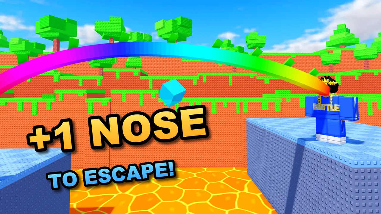
Version 1: a screenshot with a title
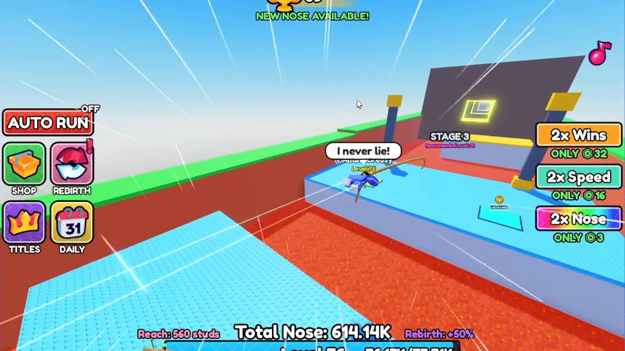
My first try was a shot from the game with the title on top. It shows the real game, which is honest, but at a small size it's just a busy scene. You can't tell what the game is about, and the player is tiny.
Version 2: riding the nose
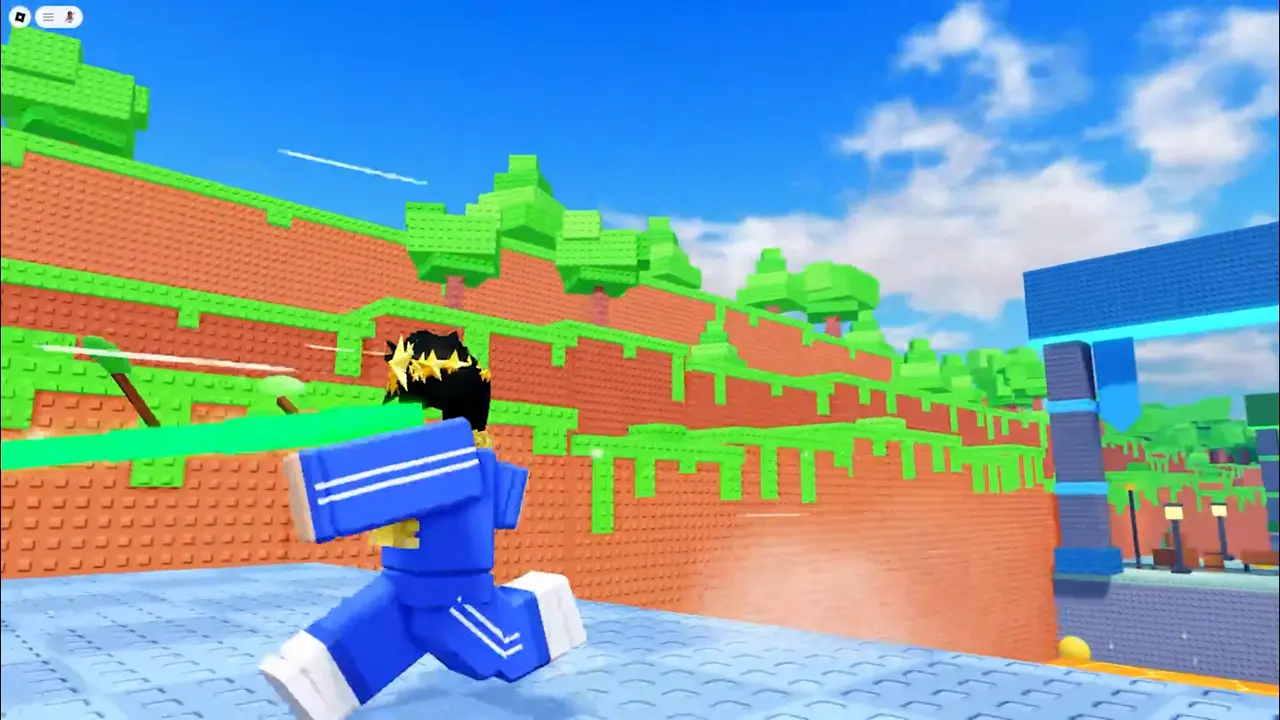
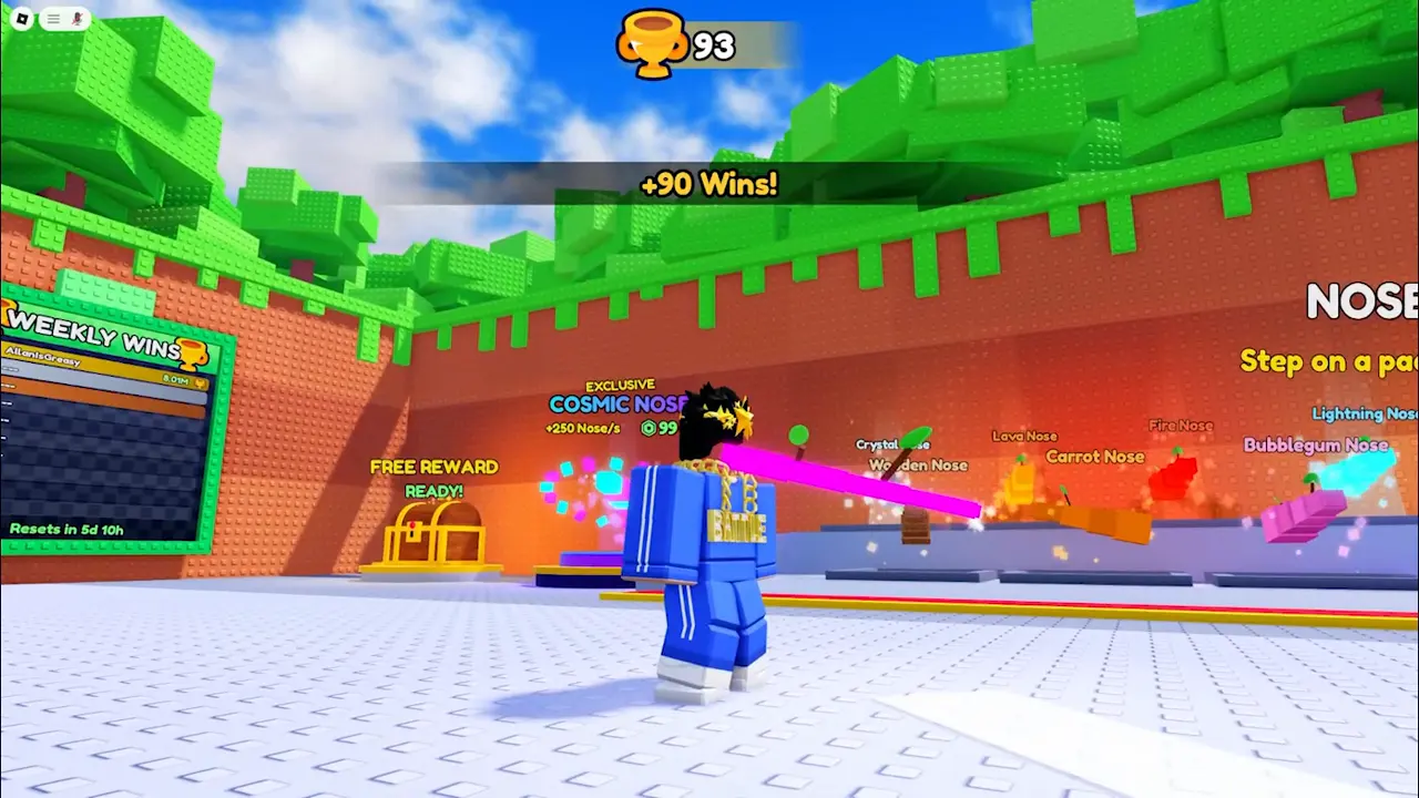
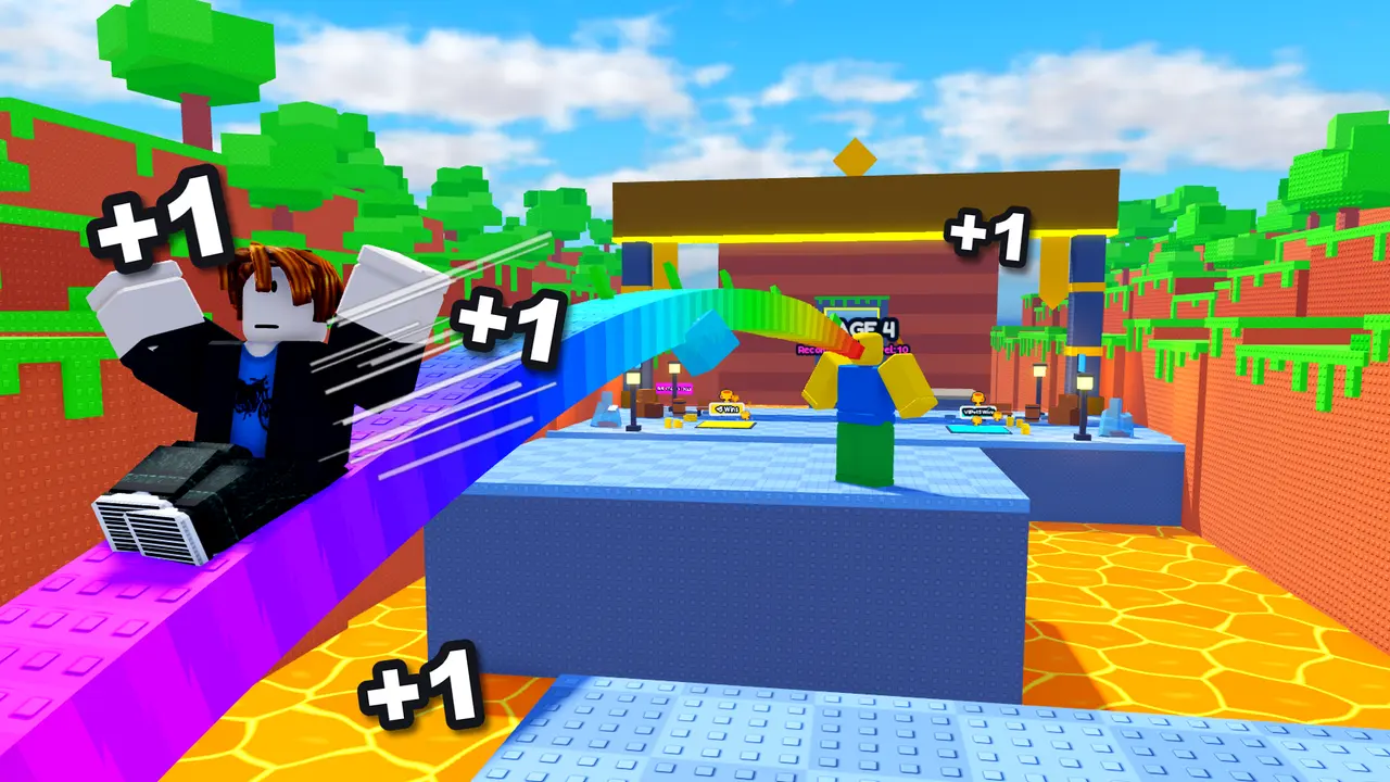
Fifteen minutes later I had the idea that stuck: show someone riding a stretched nose, with "+1"s around them. That's the one thing that makes this game different, so it should be the whole picture. This version was still set in the busy lobby, though.
Version 3: a Blender render
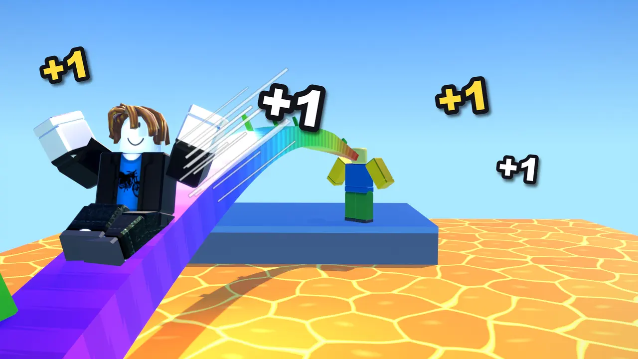
Next I exported a scene from Roblox Studio and rendered it in Blender, to get cleaner lighting over the lava. It took a lot of fixing, because the export lost the characters' heads and hair and they had to be added back. And in the end it just looked weird. It didn't look like Roblox anymore.
Versions 4 and 5: back to Studio
So I went back to setting up the shot inside Studio, where it looks like the real game, and worked on the layout:
- One big rider in front, sliding toward you, with the nose's owner small in the back.
- A thick white outline around the rider, which is what makes a character pop at a small size.
- Big "+1"s around the rider.
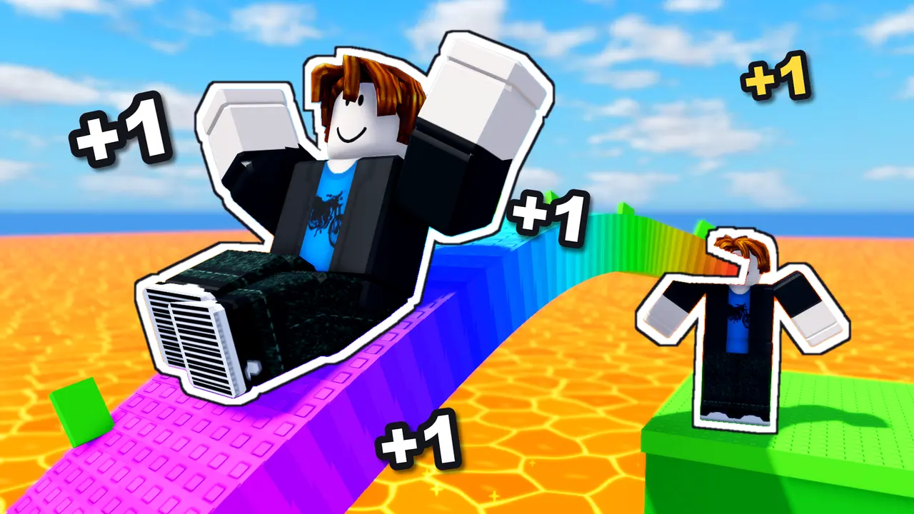
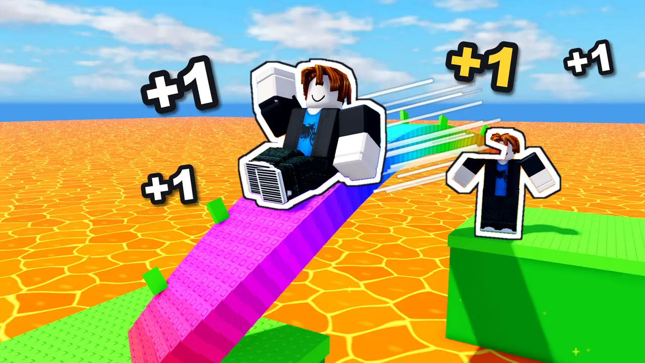
That layout was right. But the Studio characters are blocky, and the scene still looked a bit flat next to the thumbnails of the biggest games.
Versions 6 to 8: the final art
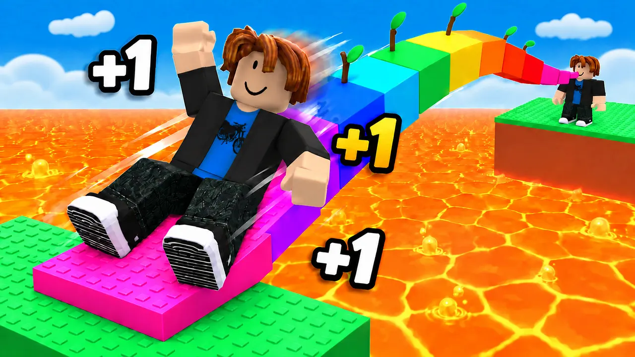
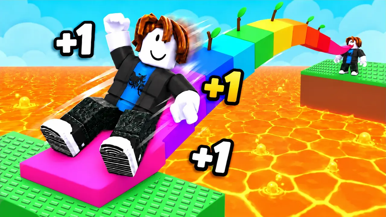
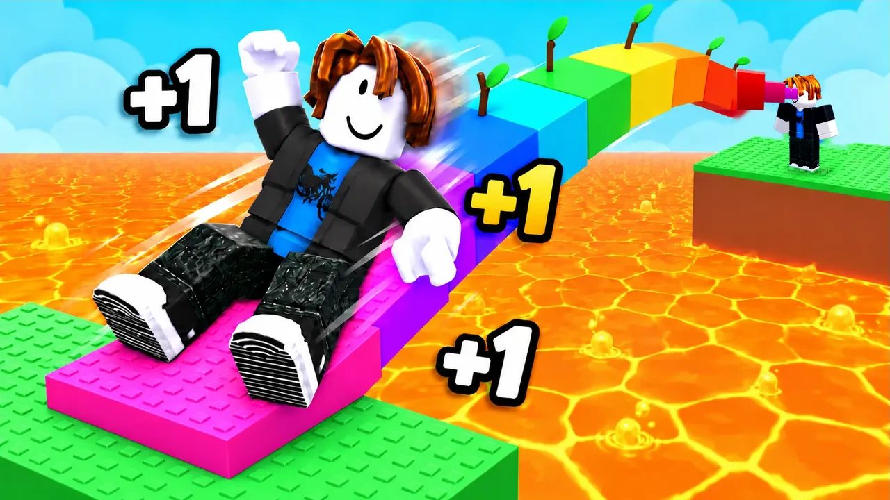
For the final version I used ChatGPT's image tool. I wrote it a brief and gave it my own pictures as references: the layout from version 4, a close-up of the real nose, the lava pattern from the game, and my avatar. The rules in the brief were:
- The nose is a flat, blocky, rainbow bridge made of toy bricks, never round.
- The players are happy and rounded, with the classic bacon hair.
- Bright blue sky, cartoon lava, green studded platforms.
- Chunky white "+1"s with a black outline.
Then it took a few rounds of fixes to the clouds, the colours and the faces.
What I learned
- Test it small. Look at your thumbnail at the size it shows on the Roblox home page. If you can't tell what's happening, it's too busy.
- One big character beats a wide scene. A big happy player sells the game better than showing everything in it.
- Show the one thing your game is about. Mine is the nose. Everything else is secondary.
- Keep it true to the game. The final art is cleaner than a screenshot, but everything in it is really in the game: the rainbow nose, the lava, the platforms and the "+1"s. If players join and it looks nothing like the thumbnail, they leave.
Next: making the trailer.